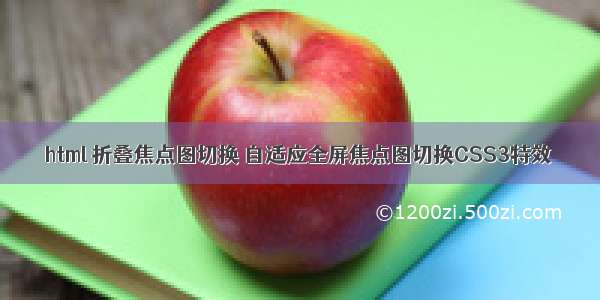
自适应全屏焦点图切换CSS3特效代码
*{margin:0;padding:0;list-style: none;}
img.bg{min-width: 1024px;min-height: 100%;width: 100%;height: auto!important;height: 100%;position: fixed;top: 0;left: 0;z-index: 1;}
@media screen and (max-width: 1024px) {
img.bg{
left: 50%;
margin-left: -512px;
}
}
.slider{
position: absolute;
width: 100%;
text-align: center;
z-index: 999;
bottom: 100px;
}
.slider li{
display: inline-block;
width: 170px;
height: 130px;
margin-right: 15px;
}
.slider a{
display: inline-block;
width: 170px;
padding-top:70px;
padding-bottom:20px;
position: relative;
cursor: pointer;
border:2px solid #fff;
border-radius: 5px;
vertical-align: top;/*设置元素的垂直对齐方式。*/
color: #FFFFFF;
text-decoration: none;
font-size: 22px;
font-family: "楷体";
text-shadow: -1px -1px 1px rgba(0,0,0,0.8),
-2px -2px 1px rgba(0, 0, 0, 0.3),
-3px -3px 1px rgba(0, 0, 0, 0.3);
}
.slider li:nth-of-type(1) a{
background-color: #02646e;
}
.slider li:nth-of-type(2) a{
background-color: #eb0837;
}
.slider li:nth-of-type(3) a {
background-color: #67b374;
}
.slider li:nth-of-type(4) a {
background-color: #e6674a;
}
.slider li:nth-of-type(5) a {
background-color: #e61061;
}
.slider a::after{/*:after选择器在被选元素的内容后面插入内容。*/
content: "";
display: block;
height: 120px;
width: 120px;
border:5px solid #fff;
border-radius: 50%;
position: absolute;
left: 50%;
margin-left: -60px;
z-index: 9999;
top: -80px;
}
.slider li:nth-of-type(1) a::after {
/*:nth-of-type(n)选择器匹配属于父元素的特定类型的第N个子元素的每个元素.*/
background: url(img/sbg1.jpg) no-repeat center;
}
.slider li:nth-of-type(2) a::after {
background: url(img/sbg2.jpg) no-repeat center;
}
.slider li:nth-of-type(3) a::after {
background: url(img/sbg3.jpg) no-repeat center;
}
.slider li:nth-of-type(4) a::after {
background: url(img/sbg4.jpg) no-repeat center;
}
.slider li:nth-of-type(5) a::after {
background: url(img/sbg5.jpg) no-repeat center;
}
.slider a::before{
content: "";
display: block;
height: 120px;
width: 120px;
border:5px solid #fff;
border-radius: 50%;
position: absolute;
left: 50%;
margin-left: -60px;
z-index: 99999;
top: -80px;
background:rgba(0,0,0,0.3);
}
.slider a:hover::before{
opacity: 0;
}
@-webkit-keyframes 'slideLeft'{
0%{
left:-500px;
}
100%{
left:0;
}
}
.slideLeft:target{
/*:target选择器可用于选取当前活动的目标元素*/
z-index: 100;
animation: slideLeft 1s 1;
-webkit-animation: slideLeft 1s 1;
}
@-webkit-keyframes 'slideBottom'{
0%{
top:350px;
}
100%{
top:0;
}
}
.slideBottom:target{
/*:target选择器可用于选取当前活动的目标元素*/
z-index: 100;
animation: slideBottom 1s 1;
-webkit-animation: slideBottom 1s 1;
}
@-webkit-keyframes 'zoomIn' {
0% {
-webkit-transform: scale(0.1);
}
100% {
-webkit-transform: none;
}
}
.zoomIn:target {
z-index: 100;
-webkit-animation: zoomIn 1s 1;
animation: zoomIn 1s 1;
}
/* Zoom Out */
@-webkit-keyframes 'zoomOut' {
0% {
-webkit-transform: scale(2);
}
100% {
-webkit-transform: none;
}
}
.zoomOut:target {
z-index: 100;
-webkit-animation: zoomOut 1s 1;
animation: zoomOut 1s 1;
}
/* Rotate */
@-webkit-keyframes 'rotate' {
0% {
-webkit-transform: rotate(-360deg) scale(0.1);
}
100% {
-webkit-transform: none;
}
}
.rotate:target {
z-index: 100;
-webkit-animation: rotate 1s 1;
animation: rotate 1s 1;
}
@-webkit-keyframes 'notTarget' {
0% {
z-index: 75;
}
100% {
z-index: 75;
}
}
.bg:not(:target) {
-webkit-animation: notTarget 1s 1;
animation: notTarget 1s 1
}
.page {
text-align:left;
}
Hipster Fashion HaircutCloud Computing Services & ConsultingMy haire is sooo fantastic!Eat healthy & excersice!Lips so kissable I could die ...